
We’re producing maps with an undergraduate mapping class at UC Berkeley and would like your help in crowdsourcing. If you see anything we’ve missed, or any problems or issues, please comment. See the full map here.
I’ve been a Mission resident since 1998 and a professor emeritus at Berkeley’s J-school since 2019. I got my start in newspapers at the Albuquerque Tribune in the city where I was born and raised. Like many local news outlets, The Tribune no longer exists. I left daily newspapers after working at The New York Times for the business, foreign and city desks. Lucky for all of us, it is still here.
As an old friend once pointed out, local has long been in my bones. My Master’s Project at Columbia, later published in New York Magazine, was on New York City’s experiment in community boards.
As founder/executive editor at ML, I've been trying to figure out how to make my interest in local news sustainable. If Mission Local is a model, the answer might be that you - the readers - reward steady and smart content. As a thank you for that support we work every day to make our content even better.
More by Lydia Chávez
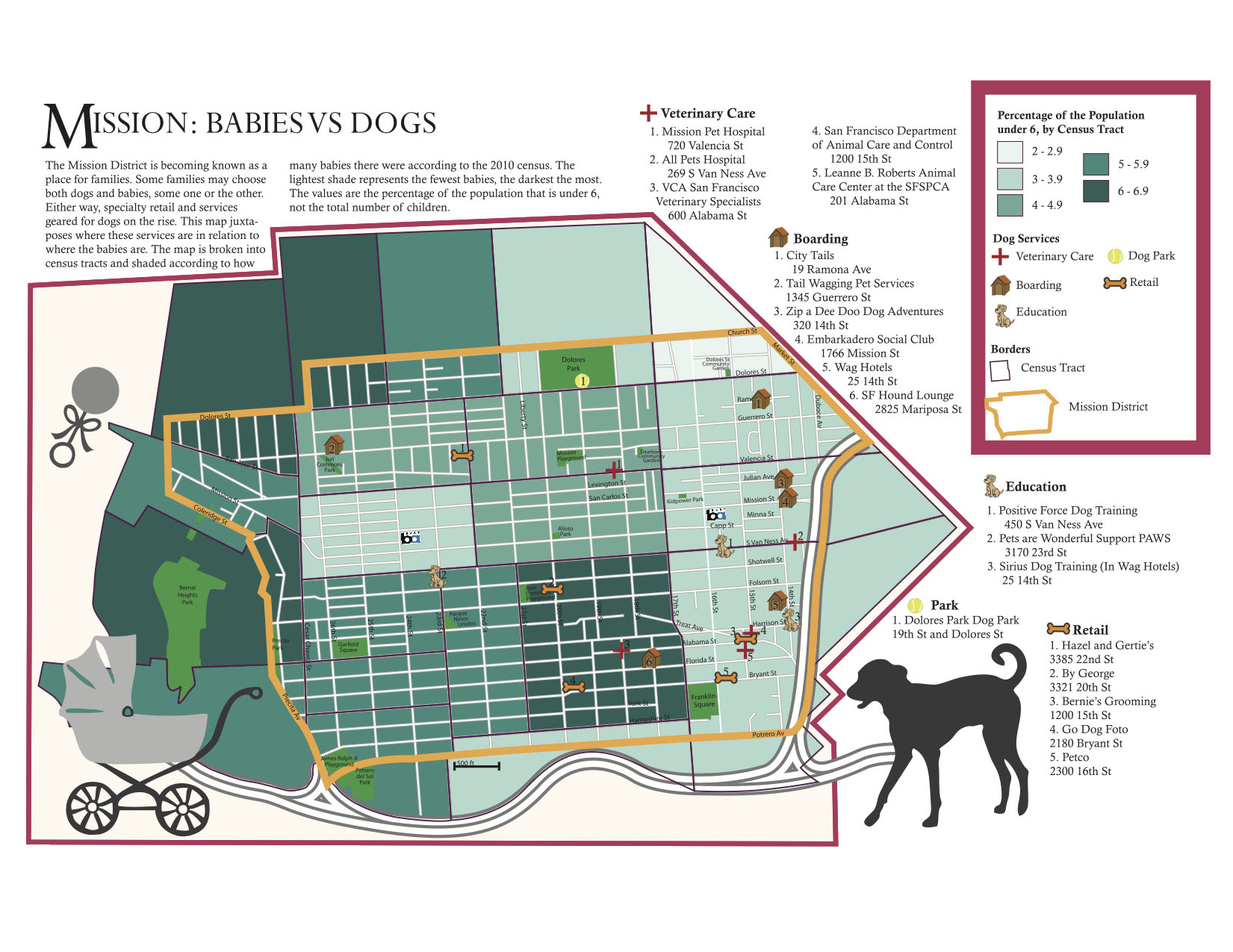
Your map is sideways, which wouldn’t be a big deal (though always annoys me), but you completely left out the directional compass. If you ask any decent cartographer, they’ll tell you that without the compass, scale line, and legend, this is just a picture (all 3 required).
Also, you don’t need to explain the color differentiation in the summary. That info should be clear in the legend. If it’s not, then your legend has problems.
Finally, is this map providing any insight? Not really. You’re comparing number of babies to locations of dog stores. These two sets of data are completely unrelated, and don’t have any effect on each other. I’m actually perplexed. Why not make a map comparing the number of new cars vs. locations of donut shops?
Keep trying…
This map reeks of “Gangs and Cupcakes” vanity. In case you missed it: http://missionlocal.org/2011/03/gangs-and-cupcakes/
But I will say that “vs.” in the title is a lot funnier. I was hoping to see a map of where babies have been eaten by dogs. Eaten sideways, that is.
Stephan, Michael, Aaron, Thank you–we will definitely consider all of these points and will add to the map. And Aaron, it’s clear you don’t like the map, but at least you made me laugh. lc
You included scale, which is cool– although it’s not in metric, small typographic face indicating faint disappointment. But a compass rose or some other indication of which way north is would be a good idea.