San Francisco’s districts are being redrawn, and a final draft must be reached by April 15.
The nine-member task force charged with creating the new districts will discuss four new maps this Saturday, starting at 10 a.m., in an effort to reach a consensus. Their job is a difficult one: redrawing the districts’ boundaries so that their 2020 populations are broadly equal, while keeping historically connected neighborhoods together as much as possible.
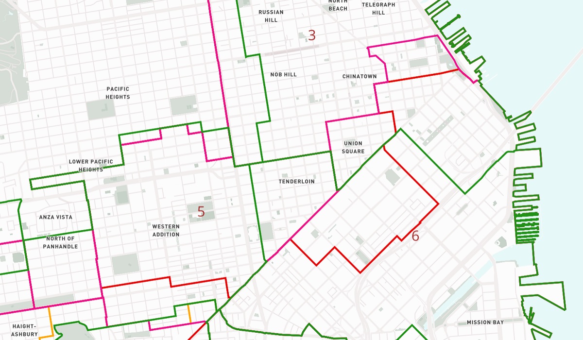
Their efforts so far have not been without controversy. Splitting SoMa from the Tenderloin proved particularly contentious last weekend, but only one of the city’s four proposed maps (Map 4D) keeps the Tenderloin in District 6.
Take a look at the maps below to see how the four maps up for discussion could change the economic, cultural and demographic characteristics of San Francisco’s districts.
Proposed districts
Data from the Redistricting Task Force. Please note: The proposed boundaries are not fixed and will be updated in the coming weeks. You can access a full-screen version of the map here.
Proposed districts and income
Data from the Redistricting Task Force and from the 2020 American Community Survey. Please note: The proposed boundaries are not fixed and will be updated in the coming weeks. You can access a full-screen version of the map here.
Proposed districts and race
Data from the Redistricting Task Force and from the 2020 American Community Survey. Please note: The proposed boundaries are not fixed and will be updated in the coming weeks. Racial populations include those who reported as multi-racial; white, Black, and Asian populations include only non-Hispanic. You can access a full-screen version of the map here.
If you would like to comment on the proposed changes, you can send the task force your thoughts at rdtf@sfgov.org. More information about the process can be found on the Redistricting Task Force website.


Great maps Will, but might I suggest you change the next set of layers to ‘median income’ instead of ‘average income’ since we have a few billionaires here that skew your chloropleths. For more on median vs mean: http://www.mbcdp.ca/blog/median-vs-average-household-income-what-is-the-difference-between-these-indicators-and-how-to-interpret-them
Hi there – thank you for the feedback! The data here actually is showing median income, but I didn’t make that clear in the legend… I’ll update the legend tomorrow to clarify.
Putting west tenderloin & soma in one disctrict weakens it. Both areas have substantial issues to solve and having two different supervisors working on the issues
would double representation…as long as they both listen to thier constituents.
None of the draft maps issued by the Redistricting Task Force so far would create more fair, equitable representation in our local government. Of the four draft maps currently being considered by the Redistricting Task Force, Map 4D is the only path forward as it keeps the Tenderloin and West/Central SOMA united in one district, and does the best job of reflecting the community of interest needs of the three cultural districts in the area.
But Map 4D still has many substantial yet solvable problems. By moving forward with Map 4D, we, the People hope that the Redistricting Task Force will prioritize the needs of the most vulnerable and least represented people in San Francisco’s new supervisor district map. Listen to the People.
Best comparative data mapping displayed anywhere else on redistricting process! Hopefully it will aid the powers that be to produce a better outcome than that lobbied for by “special” interest! Make SF whole again!
Learn more about the Community Unity Map http://linktr.ee/UnityMap
Also show up for 9:30am rally at City Hall on Saturday April 2 (before the 10am Task Force meeting) to protect our Communities!