
Well, here I am looking at numbers again. I gather these data from Craigslist.org. They include all listings except for rooms for rent and duplications. As I look at these numbers I really want to comment, but I restrain myself, as the real insight comes from you. Weigh in — what do you see in the plots?
The graph above is my favorite. Why? Because it includes every apartment that has been listed on Craigslist for the past couple of years. The bigger red balls are the most recent plots. Individual plots are important because the sample size is so small that a place listed with a crazy high or low rent distorts the averages.
The vertical or “y” axis is the listed rent; the horizontal or “x” axis is the number of apartments. That means the plot is determined by the rent and then where the listing is in a hierarchy of units. The apartments are prioritized (sorted) first by the number of bedrooms; hence, the first clump of plots is studio apartments, the second one-bedrooms and so on. The second priority is the rental rate itself. The apartments are displayed this way so that the slope of the plots is more meaningful.
My friends politely say, “That’s pretty … pretty confusing.” Oh well, the chart has all the data points. These plots are “snapshots” taken on the first and 15th of each month.
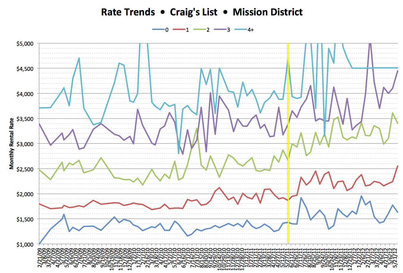
This is the one everyone likes. It’s simply the average rent of apartments offered on Craigslist. Each line represents a different bedroom configuration.
The vertical yellow line is the same time a year ago. As you can see, the sample goes clear back to 2009. I wish there was a way to determine how many people are looking for apartments in the Mission, but there isn’t. The other part of the economic equation is supply.
The chart below looks at how many apartments are for rent.

This graph stacks all apartment configurations, one atop the other. What it shows is overall availability. These aren’t averages; they are the actual number of places, listed by configuration, that were available on the first and 15th.
Of greater help is the chart below, which shows availability by configuration plotted independently, thus providing a feel for trends by configuration.

Now this is a bunch of “worm trails and fly speck.” The real fun comes from looking at the data and converting it into wild speculation, subterfuge and conspiracy theory.
Make some comments. What do you see? Be nice. There’s enough vitriol in the mainstream press.


Thanks for gathering this data and putting these visualizations together! A few comments on the first chart: it’s my favorite too, but it’s sad that we can’t click on it for a bigger version like we can the others. It would also be hugely helpful if the axes and clumps were labeled on the graph, not several paragraphs below. And by “the horizontal or “x” axis is the number of apartments”, I assume you mean “the x axis is the [ordinal] number of [each] apartment [in the list of apartments first sorted by number of bedrooms and then by rental price]”? This may seem like a pedantic distinction, but I read the sentence unambiguously as “the x coordinate of each point is the number of apartments [having that rental price],” which of course doesn’t make sense, which was very confusing. Thanks again for the data and visualizations!
Dave, wow thanks. I have gotten a lot of great input. Some of it correcting stupid mistakes like Axis labels. Anyway I, with some friends, are reworking the graphs to offer new more understandable graphs. thanks for the fun I’ll post the results if the ML editor will let me.
LABEL YOUR AXES!!!!
The dropoff in apartments offered is to be expected coming out of a recession since fewer folks would be getting evicted/forced to move due to economic circumstances. Hence more people stay put. This analysis assumes Craigslist has maintained constant market share of apmt listings, though that seems reasonable however I’m not sure whether some of the new professonally managed buildings coming on line will use CL.
You bet John, There are so many variables and untapped data sources. I used Craig’s List because it was relatively easy to extract data, clean it, and drop it into excel. That said, using only one data source paints only part of the picture and leaves a lot of questions. Also, I agree with your thoughts on staying put and folks forced to leave their apartments due to economic reasons. Thanks again for your thoughts.
With the first graph, it’s hard to easily see the rate of change of the slope of the supply curve. Could you do those as 3d surfaces? (“Mountain range” style.) I think it’d be clearer.
Hey Heather, Great idea. How could I go about representing the data as “mountain range”. What I would love to do is to animate the plots I think that would be great but I have no clue of how to do it. any ideas???
Once upon a time I would use Mathematica, which is pretty, but costs money.
It looks like gnu octave can do it. It’d be something like “mesh([ a1, a2, a3, … an; b1, b2, b3, … bn; … ; x1, x1, x3, … xn ])” to plot the n by x values.
(I’m sure that’s not going to wrap very prettily, but I hope you see what I mean.)
I’m on it. Let’s see what I can come up with. thank you very much.
The STACKED availability graph is the most useful to a person looking for an apartment. It should translate easily into extreme motivation.
For your final two graphs, by plotting both the first and the fifteenth of the month you are introducing non explanatory variation to your chart. If you plotted just the first, or just the fifteenth, or an average of the first and the fifteenth the chart would speak much more accurately to the supply of housing in the market, and would be easier to read.
Hi Matt, Thanks for the input. My thinking was to view the data in a simple time series without seasonal or monthly consideration. So, the extracts were simply 15 days apart without regard to anything else. I stuck to the first and the fifteenth no averages or exceptions. If the extract looked weird it was still included because I thought any manipulation would amount to editorializing. Like Sgt. Friday I wanted to stick to the facts. Simon (above) requested the raw data let’s see what he comes up with. And thanks again for digging in it really brings stuff to life.
We are coming to the Mission!
The San Francisco Rent Board invites you to attend a free landlord/tenant neighborhood outreach event at the Women’s Building (3543 18th Street) on Saturday June 16th from 10:30am-12:30 pm. (English/Spanish)
Staff from the city department will give a short overview presentation of the rent control ordinance. Topics covered will include rent increase limitations, eviction regulations, security deposits and interest, roommates and subletting, master tenants, and landlord passthroughs. Attendees will be provided with valuable rental and eviction information and have the opportunity to meet briefly with staff to discuss their individual concerns. If tenants are in a rental dispute with their landlord/master tenant or a landlord has grounds for a lawful rent increase the Rent Board provides arbitration and mediation services with no filing cost to the parties. Petition forms will be available and staff will assist all parties to understand when and how to file.
I’m pretty sure this means that the world is going to end!
And I’m also glad that I got my apartment in April of 2009 when rents had actually dipped.
The author should really buy a book from Stephen Few. Such a simply topic made so overly complicated. Good intentions though.
He has written a few which one would you recommend. So, many books so little time.
Dear Me, I just re-read my comment and realized that it may have seemed to be a “smarty pants” remark. A cheap play on the word few (multiple) and Few (the author’s) name. I’m sorry. I really meant which of the autor’s books would you recommend as the “gateway drug” for his work? Thanks again and sorry.
Unless we start building more housing, there will be an even lower supply of rental units after the next wave of ownership conversions (to both Condos and TICs).
Out walking passed by the Armory and right next door 2/3 framed is a “202 residential Apartments” I am assuming the “Apartments” means San Francisco apartments not New York apartments which, in my view, are condos. That is a giant block of apartments coming on soon.
You’re assuming the supply would increase by the demand would remain constant. This is not a reasonable assumption.
-by +but
I think the data say housing crisis. But that’s just me.
Can you share the raw data? I’d like to take a look at it. Thanks!
Hi Sam, You are right there are many other metrics that would make the numbers more fun. The problem is that I only have the time to skim off the easy stuff. What I’d really like to know is: how long do the apartments last before they are rented and how many people are looking.
Gosh sorry Simon, I replied to sam in your box. Now as for your request for the data. Sure I’d love to share the data with you. If you could send your request to MissionLocal with the email to which the file should be sent. They can get it to me and I’ll shoot you the numbers. What kind of file would you like?
This is great! Why not do them by color and shape on a map, though? It would be nice to know when an apartment is listed at outrageously more than any similar unit on the same block. Also, legends would be nice – which color line tells you how many bathrooms the place has? What about laundry, or parking?
Hi Sam, You are right there are many other metrics that would make the numbers more fun. The problem is that I only have the time to skim off the easy stuff. What I’d really like to know is: how long do the apartments last before they are rented and how many people are looking.